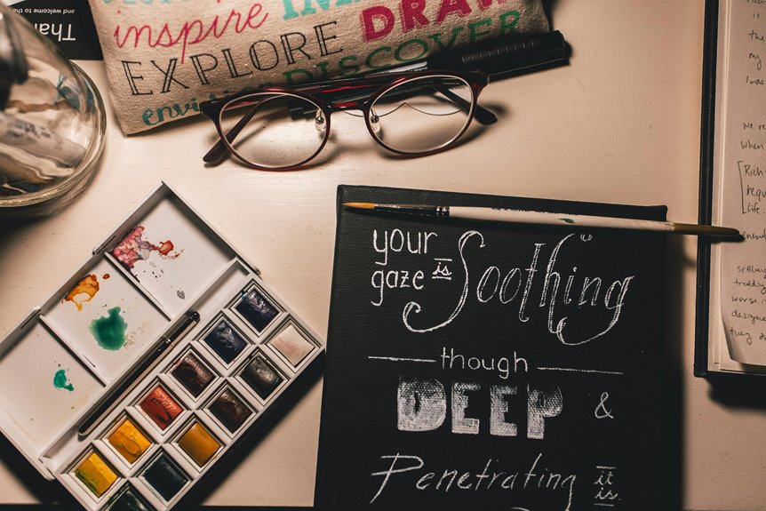
Using analogous colors in your workspace can truly create a soothing and cohesive environment. These colors sit next to each other on the color wheel, promoting calmness and focus. For instance, pairing soft greens with blues can enhance tranquility, while warm yellows with oranges can inspire energy. Incorporating these hues thoughtfully helps balance mood and productivity. Discover more about how to select and implement these colors to boost your workspace’s atmosphere.
Key Takeaways
- Analogous colors, such as soft greens and blues, create a cohesive and calming atmosphere ideal for focus and productivity.
- Choosing a palette of three to five complementary colors can significantly influence mood and enhance creativity in the workspace.
- Incorporating natural elements, like plants, alongside analogous colors softens vibrant hues and promotes tranquility.
- Utilize natural light to enhance the appearance of chosen colors, maximizing their calming effects throughout the day.
- Select textiles and artwork that reflect your color palette to maintain harmony and comfort in your workspace.
Understanding Analogous Colors
When you explore color theory, you’ll quickly discover that analogous colors play an essential role in creating a harmonious workspace. These colors sit next to each other on the color wheel, forming a cohesive palette that’s visually appealing.
By using analogous colors, you can establish a calming atmosphere that encourages focus and productivity. For instance, pairing soft greens with blues or warm yellows with oranges can create a soothing environment.
You don’t need to overcomplicate your choices; just select three to five colors that complement each other. Integrating these hues into your workspace through wall paint, decor, or furniture can greatly impact your mood and creativity.
The Psychological Effects of Color in the Workspace
Colors in your workspace can greatly affect your mood and productivity.
For instance, certain shades might inspire creativity, while others help you focus better on tasks.
Understanding these psychological effects can help you choose the right colors to create a more effective work environment.
Color and Mood
As you step into your workspace, the hues surrounding you can greatly influence your mood and productivity.
Colors have a powerful psychological effect; for instance, blue often evokes calmness and focus, while yellow can spark creativity and energy. If you’re feeling anxious or stressed, soft greens and earth tones can promote tranquility and balance.
Conversely, bold reds might energize you but could also lead to feelings of agitation if overused. It’s essential to reflect on how these colors interact with your tasks and personal preferences.
Productivity and Focus
Although many factors contribute to productivity, the colors in your workspace play an essential role in maintaining focus and motivation. When you choose calming shades like soft blues and greens, you create an environment that promotes concentration and reduces stress.
These colors can help you think clearly, allowing for deeper engagement with your tasks. On the other hand, brighter colors like yellow can stimulate creativity but might be overwhelming if overused.
It’s vital to strike a balance that suits your work style. By surrounding yourself with analogous colors, you foster a cohesive atmosphere that encourages sustained focus and enhances your overall productivity.
Choosing the Right Color Palette
When you’re designing a soothing workspace, selecting the right color palette can greatly influence your mood and productivity.
Start by considering colors that evoke calmness, such as soft blues, gentle greens, or muted purples. These shades promote relaxation and help reduce stress.
Think about your personal preferences and how different colors make you feel. You might want to combine analogous colors, which are next to each other on the color wheel, to create a harmonious look. This way, you’ll achieve a cohesive aesthetic that enhances your focus.
Don’t forget to account for natural light, as it can change how colors appear throughout the day.
Ultimately, your chosen palette should reflect your style while fostering a peaceful environment.
Tips for Incorporating Analogous Colors in Your Office
Incorporating analogous colors into your office can elevate the soothing atmosphere you’ve created with your chosen palette.
To effectively use these colors, consider the following tips:
- Accent Walls: Paint one wall in a deeper shade to add depth while maintaining a harmonious look.
- Artwork: Choose pieces that showcase shades from your palette, inviting tranquility and inspiration.
- Textiles: Select curtains, cushions, or rugs that blend seamlessly, enhancing comfort without clashing.
- Plants: Incorporate greenery with leaves that complement your colors, adding life and a revitalizing vibe.
Creating a Cohesive Design With Accessories
To create a cohesive design in your workspace, focus on selecting accessories that echo your color palette and overall aesthetic.
Think about items like desk organizers, wall art, and decorative plants. Choose colors and materials that complement your chosen scheme. For instance, if your palette features soft blues and greens, look for accessories in similar shades or with subtle patterns that enhance these colors.
Consider desk organizers, wall art, and plants in colors that align with your palette for a harmonious workspace.
Textures also play a significant role; mix smooth finishes with natural materials to add depth without creating chaos. Remember, less is often more. By limiting the number of colors and styles, you’ll maintain harmony in your workspace.
Ultimately, your accessories shouldn’t only serve a purpose but also contribute to a calming and inviting environment.
Balancing Color With Natural Elements
To create a calming workspace, you can balance vibrant colors with natural elements like plants and decor.
Incorporating greenery not only enhances your environment but also boosts your mood and productivity.
Plus, don’t underestimate the power of natural light; it can transform your space and complement your chosen color palette beautifully.
Integrating Plants and Decor
While creating a soothing workspace, balancing colors with natural elements like plants and decor can greatly enhance your environment.
Integrating these elements not only brings life to your space but also softens the impact of your chosen colors. Consider adding items that complement your color palette and promote tranquility.
- A lush snake plant with deep green leaves
- Soft, earthy-toned ceramic pots
- A delicate hanging macrame planter
- Warm, textured textiles like a woven wall hanging
These additions create a harmonious atmosphere, inviting calmness and creativity.
Natural Light Benefits
How can natural light enhance your workspace’s soothing atmosphere? It brings warmth and energy, making your environment feel more inviting.
Natural light boosts your mood and productivity, reducing stress levels. When you combine natural light with your chosen soothing colors, the effect is even more profound. Sunlight helps colors appear more vibrant, accentuating the calming hues in your space.
To maximize this benefit, position your desk near windows or use sheer curtains to diffuse harsh sunlight. You’ll not only enjoy a brighter workspace but also create a balanced connection with nature.
This harmonious blend of light and color helps you stay focused and relaxed, fostering creativity and well-being throughout your day. So, embrace natural light for a truly soothing workspace.
Evaluating the Impact of Color on Productivity
Color plays an essential role in shaping our workspace, influencing not just aesthetics but also productivity. The right hues can enhance focus, creativity, and overall mood.
When selecting colors, consider how they affect your performance.
- Calming blues help reduce stress, making it easier to concentrate.
- Energetic yellows can spark creativity and encourage fresh ideas.
- Fresh greens promote balance and harmony, contributing to a comfortable atmosphere.
- Warm oranges can stimulate enthusiasm and teamwork.
Frequently Asked Questions
What Are Some Examples of Analogous Color Combinations?
You can explore combinations like blue, blue-green, and green or red, red-orange, and orange. These pairings create a harmonious visual flow, making your space feel cohesive and inviting while enhancing your overall aesthetic.
Can I Use Analogous Colors in Small Spaces?
Absolutely, you can use analogous colors in small spaces! They’ll create a harmonious feel, making the area seem larger and more inviting. Just choose lighter shades for a brighter, airier atmosphere that enhances your space.
How Do Lighting Conditions Affect Color Perception?
Lighting conditions greatly impact how you perceive colors. Natural light enhances vibrancy, while artificial lights can alter hues. Experimenting with different light sources helps you see how they change the mood and feel of your space.
Are There Any Color Combinations to Avoid?
You should avoid clashing colors like red and green or bright yellow together. These combinations can create visual tension, making a space feel chaotic. Stick to complementary or harmonious colors for a more balanced environment.
Can I Mix Analogous Colors With Other Color Schemes?
Yes, you can mix analogous colors with other schemes! Just guarantee the combinations harmonize well. Play with contrasting elements or complementary colors to add interest while maintaining balance. Experimenting can lead to beautiful, unique designs!