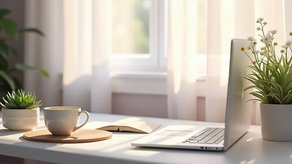
To create a stress-free workspace, consider calming color palettes that incorporate soft blues, gentle greens, and warm neutrals. Soft blue promotes tranquility, while green brings nature indoors, reducing stress. Warm neutrals create a cozy atmosphere. You might also add serene lilacs for elegance and light yellows for positivity. Combining these colors can enhance focus and productivity. Explore how to mix and match these shades further to find the perfect palette for your workspace.
Table of Contents
Key Takeaways
- Soft blues create a tranquil environment, enhancing focus and creativity without overwhelming the mind.
- Gentle greens evoke nature's calmness, reducing stress and boosting productivity in workspaces.
- Warm neutrals, like soft beiges, foster a cozy atmosphere, encouraging comfort and concentration.
- Cool grays offer a professional yet serene backdrop, aiding focus during high-pressure tasks.
- Incorporating serene lilacs and light yellows adds tranquility and positivity, promoting creativity and reducing stress.
Understanding the Psychology of Color
When you choose colors for your workspace, it's essential to understand how they affect your mood and productivity. Colors can evoke specific emotions and influence your focus.
For instance, warm colors like red and orange can energize you but might also create stress if overused. On the other hand, neutral tones like beige or gray can foster a sense of calm but may feel too dull without some vibrant accents.
Consider how you respond to different shades; personal preferences play a significant role. Additionally, think about the nature of your work. If you need creativity, brighter colors might inspire you, while cooler tones can enhance concentration for analytical tasks.
Balancing these elements will help create a productive and pleasant workspace.
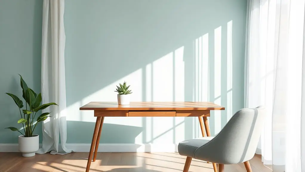
Soft Blues: The Color of Tranquility
Soft blues can transform your workspace into a serene oasis, allowing you to feel calm and focused throughout the day. This gentle hue evokes the feeling of a clear sky or tranquil waters, promoting relaxation and reducing stress.
Soft blues create a serene workspace, fostering calmness and focus while promoting relaxation and reducing stress.
When you surround yourself with soft blues, your mind can breathe, enhancing creativity and concentration. Consider painting your walls in a light blue shade or adding soft blue accents through decor, such as cushions or artwork.
Even a soft blue desk accessory can create a soothing environment. You'll find that this color encourages clarity in thought and helps you manage tasks without feeling overwhelmed.
Embrace soft blues to cultivate a workspace that nurtures tranquility and productivity.
Gentle Greens: Nature's Calming Influence
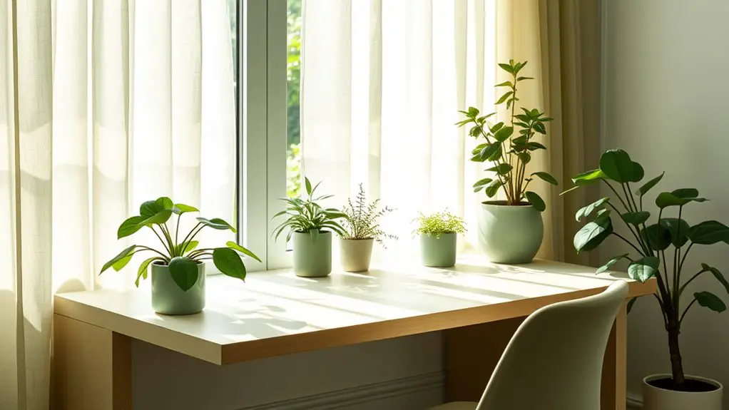
Incorporating gentle greens into your workspace can bring the calming essence of nature indoors. These soothing shades help reduce stress and enhance focus, creating a serene atmosphere. Picture your office adorned with soft greenery, instantly uplifting your mood.
| Shade | Effect |
|---|---|
| Mint Green | Revitalizing and energizing |
| Sage Green | Grounding and peaceful |
| Seafoam Green | Invigorating and soothing |
| Olive Green | Balanced and restorative |
| Forest Green | Deeply calming and secure |
Using these gentle greens, whether through wall paint, furniture, or plants, fosters a tranquil environment. You'll feel more connected to nature, allowing for increased creativity and productivity throughout your workday.
Warm Neutrals: Creating a Cozy Atmosphere
Creating a cozy atmosphere in your workspace can be easily achieved with warm neutrals. These shades, like soft beiges, taupes, and warm grays, create a welcoming environment that fosters productivity and comfort.
By incorporating these colors on your walls or through your furniture, you'll instantly soften the room's feel. Adding warm-toned accessories, such as cushions or artwork, can enhance this inviting vibe.
Incorporating warm neutrals in your decor instantly softens the atmosphere, while warm-toned accessories enhance the inviting vibe.
Consider using natural materials like wood or wool to complement the warm neutrals, creating a cohesive look.
Lighting is essential too; opt for warm white bulbs to amplify the cozy feel.
With these simple touches, you'll find that your workspace transforms into a nurturing haven, making it easier to focus and feel at ease throughout your day.
Muted Pinks: Invoking Comfort and Compassion
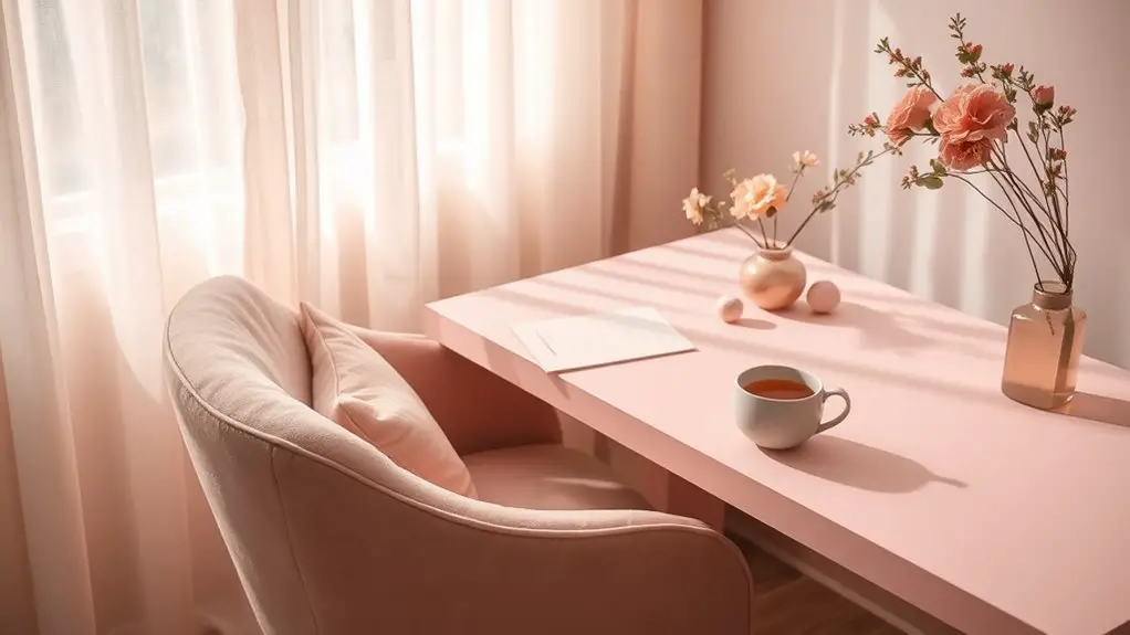
Muted pinks can transform your workspace into a haven of comfort and compassion.
By understanding the emotional impact of this gentle hue, you can harness its calming effects to foster a supportive environment.
Let's explore how to design with muted pinks to enhance your workspace's overall vibe.
Emotional Impact of Pink
When you consider the emotional impact of pink in your workspace, muted shades of this color often evoke feelings of comfort and compassion.
These gentle hues create a soothing environment that can help reduce stress and promote a sense of calm. Incorporating muted pinks into your office decor can foster a nurturing atmosphere, encouraging open communication and collaboration among team members.
You might find that these shades soften the overall aesthetic, making the space feel more inviting and warm. Whether it's through accent walls, furniture, or accessories, using pink can enhance your emotional well-being, allowing for creativity and focus.
Ultimately, embracing muted pinks in your workspace can transform your daily experience, making work feel less intimidating and more enjoyable.
Color Psychology Insights
Incorporating muted pinks into your workspace not only enhances the aesthetic but also taps into the principles of color psychology. This gentle hue evokes feelings of comfort and compassion, making it an ideal choice for reducing stress and promoting a sense of calm.
When you surround yourself with muted pinks, you're likely to feel more at ease, fostering a nurturing environment that encourages creativity and collaboration. This color can also create a welcoming atmosphere, making it easier to connect with colleagues and clients alike.
Designing With Muted Pinks
By choosing muted pinks for your workspace, you can effortlessly create an atmosphere that feels both inviting and serene. This soft hue invokes feelings of comfort and compassion, making it ideal for enhancing your productivity while reducing stress.
Incorporating muted pinks through wall paint, furniture, or accessories can transform your environment into a calming retreat.
Pair muted pinks with neutral tones like beige or soft gray to maintain balance and sophistication in your design. You might also consider adding plants or natural textures to complement the warmth of the pink shades.
Cool Grays: The Balance of Calm and Professionalism
When you choose cool grays for your workspace, you create an atmosphere that balances calmness with professionalism.
This versatile color can influence your mood and productivity, making it a smart choice for office design.
Plus, pairing gray with other colors can enhance its soothing effects while adding visual interest.
Psychological Effects of Gray
While some might view gray as dull or uninspiring, it actually offers a unique blend of calmness and professionalism in workspaces.
This color can create a serene environment, helping you focus without overwhelming distractions. Gray encourages a sense of balance, allowing your mind to clarify thoughts and ideas.
It fosters a feeling of stability, which can be especially beneficial during high-pressure tasks or meetings.
Gray in Office Design
Gray's versatility makes it a popular choice in office design, particularly when considering cool grays that embody both calm and professionalism.
When you incorporate cool grays into your workspace, you create an atmosphere that promotes focus and reduces stress. This neutral tone allows other elements of your office, like furniture or artwork, to stand out without overwhelming the senses.
You can use varying shades of gray to define spaces, such as darker grays for accents and lighter shades for walls. This balance not only enhances the aesthetic but also fosters a sense of harmony.
Combining Gray With Colors
Incorporating colors alongside gray can elevate your workspace, creating a dynamic yet soothing environment. Cool grays serve as a perfect backdrop, allowing you to introduce vibrant tones like teal or soft pastels. These colors not only add warmth but also promote creativity and focus.
Imagine a gray desk paired with teal accents; it's professional yet invigorating.
You might also consider adding earthy tones, like sage green, which harmonize beautifully with gray while invoking a sense of calm. Use colorful artwork or plants to break the monotony and infuse life into your space.
Earthy Browns: Grounding Your Workspace
As you design your workspace, earthy browns can create a calming environment that fosters focus and creativity. These rich tones evoke a sense of stability and warmth, making your space feel inviting. Incorporating earthy browns in furniture, decor, or wall colors can ground your emotions and help you concentrate.
| Element | Effect on Workspace |
|---|---|
| Dark Brown | Adds warmth and sophistication |
| Light Beige | Promotes a sense of openness and tranquility |
| Walnut Accents | Introduces elegance and comfort |
Using earthy browns in combination with lighter shades can enhance your workspace's overall feel. You'll find that it not only boosts your mood but also encourages a productive atmosphere.
Serene Lilacs: A Touch of Soothing Elegance
When you want to infuse your workspace with a sense of calm and elegance, serene lilacs can be an excellent choice. This soft hue promotes tranquility, making it perfect for reducing stress during busy workdays.
You can incorporate lilac through wall paint, office accessories, or artwork, creating a subtle yet impactful atmosphere. Pair it with neutral tones like whites or grays to enhance its soothing qualities.
Consider adding lilac plants or flowers for a natural touch that brings life into your space. The gentle essence of lilac encourages creativity and focus, helping you feel more at ease as you tackle tasks.
Light Yellows: Infusing Positivity and Energy
Light yellows can instantly elevate your workspace, bringing a burst of positivity and energy that keeps you motivated throughout the day. This cheerful hue stimulates creativity and can help reduce stress, making it an excellent choice for your office.
To maximize the benefits of light yellows, consider incorporating them in various ways:
| Application | Effect |
|---|---|
| Walls | Brightens and opens up space |
| Accents | Adds cheerful pops of color |
| Desk accessories | Inspires creativity and focus |
| Artwork | Infuses positivity and warmth |
Combining Colors: Creating Harmonious Palettes
When it comes to creating harmonious palettes, understanding color theory is key.
You'll want to explore the balance between cool and warm tones to achieve the right vibe in your workspace.
Nature-inspired combinations can also provide a calming effect, making your environment more inviting and productive.
Color Theory Basics
Color theory is essential for creating harmonious palettes that enhance your workspace. Understanding how colors interact will help you design a calming environment.
Here are three key principles to examine:
- Complementary Colors: These are opposite on the color wheel and create vibrant contrasts. Use them sparingly for accents to energize your space without overwhelming it.
- Analogous Colors: Found next to each other on the color wheel, these colors blend well, creating a serene and cohesive look. Think of soft greens, blues, and teals.
- Triadic Colors: This scheme uses three colors evenly spaced on the wheel. It's dynamic yet balanced, ideal for adding energy while maintaining harmony.
Cool vs. Warm Tones
Understanding the difference between cool and warm tones can transform your workspace into a calming retreat.
Cool tones, like blues and greens, evoke tranquility and can help you focus better. They create a serene environment, making it easier to tackle tasks without feeling overwhelmed.
On the other hand, warm tones, such as reds, yellows, and oranges, inspire energy and creativity. While they can stimulate action, they may also lead to feelings of restlessness if overused.
To create a harmonious palette, consider blending these tones. For instance, pairing soft blue with a warm beige can balance calmness with a touch of warmth, fostering an inviting atmosphere.
Experiment with combinations to find what resonates best with you and enhances your productivity.
Nature-Inspired Combinations
Drawing inspiration from nature can help you create harmonious color palettes that enhance your workspace. By incorporating earthy tones and calming hues, you'll foster a serene environment.
Here are three nature-inspired combinations to contemplate:
- Forest Greens: Pair deep greens with soft browns to evoke tranquility, reminiscent of a peaceful forest.
- Ocean Blues: Use varying shades of blue combined with sandy neutrals to bring the calming essence of the sea into your space.
- Desert Sunset: Blend warm terracotta with muted yellows and soft pinks to mimic the soothing colors of a desert sunset.
These combinations not only promote relaxation but also boost creativity, making your workspace a revitalizing haven.
Practical Tips for Incorporating Calming Colors in Your Office
When you want to create a calming workspace, incorporating soothing colors can make a significant difference in your productivity and mood. Start by painting your walls in soft hues like light blue or pale green. Use decorative items, such as cushions or artwork, in complementary shades. Consider adding plants, as they not only introduce a touch of nature but also enhance color balance.
Here's a quick reference table to guide your color choices:
| Color | Effect | Best Use |
|---|---|---|
| Light Blue | Reduces stress | Walls or accents |
| Soft Green | Promotes balance | Plants or decor |
| Lavender | Encourages creativity | Art or textiles |
| Beige | Creates warmth | Furniture or trim |
Frequently Asked Questions
How Do I Choose a Color Palette for a Small Workspace?
To choose a color palette for your small workspace, consider your preferences and the mood you want to create. Stick to two or three colors for balance, and test them together to guarantee harmony.
Can Color Impact Productivity in a Workspace?
Yes, color can greatly impact productivity in your workspace. Choosing vibrant colors can energize you, while softer tones promote focus. Experiment with different shades to find what enhances your concentration and creativity best.
What Colors Should I Avoid in a Stressful Environment?
In a stressful environment, you should avoid bold reds and dark blacks, as they can heighten anxiety and create tension. Instead, opt for softer hues that promote calmness and focus, enhancing your overall productivity.
How Often Should I Change My Workspace Colors?
You should consider changing your workspace colors every six to twelve months. This keeps your environment fresh and can enhance your mood, creativity, and productivity. Just make sure the new colors align with your personal preferences.
Are There Specific Colors for Different Types of Work?
Yes, certain colors can enhance productivity. For creative tasks, opt for vibrant hues like orange or yellow. For analytical work, try blue or green, as they promote focus and calmness. Choose wisely to match your tasks!


