When it comes to choosing colors based on biophilic principles, you’ll want to take into account how your selections can enhance your connection to nature. The right palette can evoke feelings of tranquility and well-being, making your space more inviting. It’s crucial to reflect on the specific purpose of each area and how colors can influence mood. But what factors should you keep in mind to create that perfect harmony? Let’s explore further.
Key Takeaways
- Select earthy tones to mimic natural elements like soil and wood, fostering a sense of comfort and connection to nature.
- Incorporate cool colors like blues and greens in workspaces to promote focus and enhance productivity.
- Use warm colors in living areas to create inviting atmospheres that encourage relaxation and social interaction.
- Test paint samples in different lighting to observe how colors change throughout the day, ensuring they align with your intended mood.
- Layer textures and incorporate natural materials to complement your color choices, enhancing the overall sensory experience of the space.
Understanding Biophilic Design and Its Importance
As you explore the world of design, understanding biophilic design becomes essential, especially since it enhances your connection to nature.
This concept emphasizes the importance of integrating natural elements into your spaces, creating environments that resonate with your innate affinity for the outdoors. By incorporating features like natural light, greenery, and organic materials, you cultivate a sense of peace and well-being.
Biophilic design not only enriches your surroundings but also improves productivity and creativity. It encourages you to think about how your environment influences your mood and behavior.
Biophilic design enhances your environment, boosting productivity and creativity while influencing your mood and behavior positively.
Embracing these principles can transform not just your spaces, but also your overall quality of life, allowing you to thrive in harmony with nature.
The Psychological Impact of Color on Well-Being
Colors play an essential role in shaping your mood and emotions, often influencing how you feel in a space.
By choosing nature-inspired color schemes, you can enhance your well-being and create a calming environment.
Let’s explore how specific colors can uplift your spirit and connect you to the natural world.
Color and Mood
When you walk into a space filled with vibrant hues, you mightn’t realize how deeply those colors affect your mood and overall well-being.
Colors can evoke emotions, influencing how you feel in your environment. For example, warm colors like red and orange can energize and stimulate, while cool colors like blue and green promote calmness and relaxation.
You may find that a yellow wall brightens your spirits, making you feel happier and more creative. Conversely, darker shades can sometimes evoke feelings of sadness or heaviness.
By choosing colors mindfully, you can create spaces that enhance your mood and foster positive emotions, ultimately supporting your mental health and well-being.
Nature-Inspired Color Schemes
Nature-inspired color schemes draw on the beauty of the natural world and can greatly enhance your well-being. By incorporating hues like soft greens, earthy browns, and calming blues, you create a soothing atmosphere that promotes relaxation and reduces stress.
These colors evoke feelings of serenity and connection to nature, making your space feel more inviting. When you choose colors reminiscent of landscapes, such as the warm golds of a sunrise or the cool grays of a rocky shore, you stimulate positive emotions and foster a sense of belonging.
Experimenting with these palettes can transform your environment, helping you feel more at peace. Remember, the right colors can make a significant difference in how you experience your surroundings!
Nature-Inspired Color Palettes
When you think about nature-inspired color palettes, consider how earthy tones, water-inspired shades, and hues from flora and fauna can transform a space.
These colors not only reflect the beauty of the natural world but also promote a sense of calm and connection.
Let’s explore how you can incorporate these elements into your design for a more biophilic approach.
Earthy Tones Selection
Embracing earthy tones can transform your space into a calming retreat that reflects the natural world. Start by selecting shades inspired by soil, stone, and wood—think warm browns, soft greens, and muted terracottas. These colors create a grounding effect, making your environment feel more connected to nature.
When choosing paints or decor, consider how each hue interacts with natural light and existing elements in your space. Warm browns can evoke a sense of stability, while gentle greens promote tranquility.
Don’t hesitate to mix these tones; they harmonize beautifully together, enhancing the overall ambiance.
Incorporating textures like natural fibers and organic materials can further enrich your earthy palette, making your retreat feel inviting and serene.
Water-Inspired Shades
Water-inspired shades can bring a rejuvenating and serene vibe to your space, drawing from the calming hues of oceans, lakes, and rivers.
Think deep blues, soft teals, and gentle aquas. These colors evoke feelings of tranquility and peace, making them perfect for bedrooms and relaxation areas.
To create a cohesive look, combine these shades with lighter neutrals or sandy beiges to mimic a beachy atmosphere. You can also add textured elements, like woven fabrics or glass accents, to enhance the aquatic theme.
Whether you choose a bold navy for an accent wall or soft seafoam for your décor, these water-inspired hues can transform your environment into a soothing retreat.
Embrace these colors to invite nature’s calm inside.
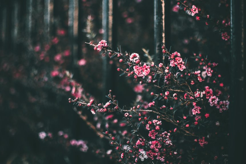
Flora and Fauna Hues
Colors inspired by flora and fauna can bring the vibrancy and diversity of nature into your home. By incorporating these hues, you can create a calming yet dynamic environment. Think of lush greens, earthy browns, and bright floral tones that mimic the natural world. Here’s a simple guide to help you choose:
| Flora/Fauna Source | Color Palette |
|---|---|
| Tropical Rainforest | Deep Greens, Bright Yellows |
| Desert Landscape | Sandy Beiges, Terracotta |
| Ocean Coral | Soft Blues, Coral Pinks |
| Mountain Meadows | Gentle Lavender, Grass Green |
| Autumn Foliage | Rich Oranges, Deep Reds |
Use these palettes to craft spaces that resonate with the essence of nature, enhancing your connection to the outdoors.
Choosing Colors for Different Spaces
When you think about designing a space, the choice of color plays an essential role in shaping the atmosphere and mood.
In living areas, opt for warm, earthy tones that evoke comfort and connection to nature. Soft greens and browns can create a serene environment, perfect for relaxation.
In workspaces, consider cool blues and greens, which enhance focus and productivity while mimicking natural elements.
For kitchens, bright yellows or light blues can stimulate energy and creativity, making cooking more enjoyable.
In bedrooms, soft pastels or muted colors promote tranquility, encouraging restful sleep.
Each color choice should reflect the intended purpose of the space, creating a harmonious balance between functionality and biophilic design principles.
Incorporating Natural Light and Color
To create a harmonious environment, you should prioritize the interplay of natural light and color in your space. Natural light not only enhances colors but also influences mood and perception. Consider the direction of your windows—south-facing rooms get warm, abundant light, while north-facing spaces tend to be cooler and softer. Choose colors that complement this light, creating a cohesive atmosphere. Light shades like soft greens or warm whites can amplify brightness, while deeper hues can add depth in well-lit areas.
Here’s a simple guide to help you choose:
| Natural Light Type | Recommended Colors |
|---|---|
| Morning Light | Soft yellows, pastels |
| Afternoon Light | Warm oranges, reds |
| Evening Light | Deep blues, purples |
| Diffused Light | Neutral tones, whites |
| Direct Sunlight | Bright colors, whites |
Balancing Warm and Cool Tones
Finding the right balance between warm and cool tones can transform your space into a serene retreat.
By blending these tones, you can create harmony and enhance the overall atmosphere. Here are four key points to reflect on:
- Identify the Mood: Decide if you want a cozy, inviting feel (warm) or a calm, revitalizing vibe (cool).
- Reflect on Natural Elements: Use warm tones to mimic sunlight and cool tones to reflect water or sky.
- Layer Textures: Introduce various materials to balance warmth and coolness, such as soft fabrics and sleek surfaces.
- Test Samples: Paint swatches on your walls to see how different tones interact with light throughout the day.
Balancing these tones can create an inviting, nature-inspired environment.
Practical Tips for Implementing Biophilic Colors in Your Space
Implementing biophilic colors in your space can breathe new life into your environment. Start by identifying colors inspired by nature, such as greens, blues, and earthy tones. Use these colors in various elements like walls, furniture, or accessories to create a cohesive look. Consider the following tips to enhance your space:
| Color | Element | Mood |
|---|---|---|
| Forest Green | Walls | Calming |
| Ocean Blue | Accents | Invigorating |
| Earthy Brown | Furniture | Grounding |
| Soft Beige | Textiles | Warmth |
| Sky Blue | Ceiling | Open & Airy |
Experiment with different shades and combinations. Don’t hesitate to draw inspiration from your surroundings to make your space a true reflection of nature.
Frequently Asked Questions
How Can I Mix Patterns With Biophilic Colors Effectively?
To mix patterns effectively, start with a few core colors that reflect nature. Balance bold patterns with subtle ones, ensuring they share a common hue. This creates harmony while celebrating the beauty of nature’s diversity.
What Role Does Texture Play in Biophilic Color Choices?
Texture adds depth and interest to your color choices, enhancing the natural feel of your space. By incorporating varied textures, you create a more immersive environment that resonates with the calming elements of nature.
Are There Cultural Considerations for Biophilic Color Selections?
Absolutely, you should consider cultural meanings behind colors when selecting them. Different cultures associate colors with specific emotions and symbols, so understanding these connections can help you create a more meaningful and harmonious environment.
How Do I Maintain Biophilic Colors Over Time?
To maintain biophilic colors over time, regularly assess your environment’s lighting and wear. Clean surfaces carefully, avoid harsh chemicals, and refresh paint or decor as needed to keep those natural hues vibrant and inviting.
Can Biophilic Colors Influence Productivity in Workspaces?
Yes, biophilic colors can greatly influence your productivity in workspaces. By incorporating nature-inspired hues, you’ll enhance focus and creativity, creating a more inviting environment that promotes well-being and encourages efficient work habits.