Planning your workspace with a color mood board can transform your environment and boost your productivity. Start by choosing colors that reflect your personal style and evoke positive emotions. Consider how textures and patterns can add depth and interest. Use design tools to gather inspirations and create a cohesive look. Remember to incorporate personal touches like artwork and plants to make the space uniquely yours. Discover more tips to enhance your workspace further.
Key Takeaways
- Identify the emotions you want to evoke in your workspace and select colors that align with these feelings.
- Gather swatches, fabric samples, and images to create a cohesive color mood board that reflects your preferences.
- Test color combinations to see how they interact under different lighting conditions for optimal appearance.
- Incorporate textures and patterns to add depth and visual interest, balancing them with your chosen color palette.
- Personalize your space with artwork, plants, and personal items that inspire, using color accents to enhance cohesion.
Understanding the Importance of Color in Workspace Design
Color plays a pivotal role in workspace design, influencing mood, productivity, and creativity. When you enter a space, the colors surrounding you can evoke specific emotions and reactions.
For instance, blue promotes calmness and focus, while yellow sparks energy and optimism. If you’re aiming for innovation, consider vibrant colors that inspire creativity.
Choosing the right palette can create an environment that enhances collaboration and boosts morale. It’s essential to think about how colors interact with natural light, as this can further impact your experience.
Elements to Consider When Creating Your Color Mood Board
When creating your color mood board, it’s essential to contemplate the emotions you want to evoke in your workspace. Think about how colors can influence your mood and productivity.
Here are some key elements to reflect upon:
- Color Psychology: Understand how different colors can trigger specific feelings, like calmness or energy.
- Personal Preferences: Include colors that resonate with you personally to make the space truly yours.
- Lighting: Reflect on how natural and artificial light affects color perception in your workspace.
- Balance: Aim for a harmonious combination of colors to avoid overwhelming or distracting yourself.
How to Choose a Color Palette That Inspires You
How can you select a color palette that truly inspires you?
Begin by reflecting on your personal preferences and the emotions you want to evoke in your workspace. Look for colors that resonate with you, whether they’re calming blues, energizing yellows, or vibrant greens.
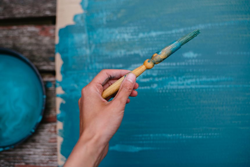
Create a mood board by gathering swatches, images, or even fabric samples that showcase these colors together. Test combinations to see how they interact; sometimes, unexpected pairings can spark creativity.
Don’t forget to reflect on the natural light in your space, as it can alter how colors appear.
Ultimately, choose a palette that not only reflects your style but also motivates you to be productive and creative in your workspace. Trust your instincts and let your personality shine through!
Incorporating Texture and Patterns Into Your Mood Board
When creating your mood board, think about how textures and patterns can enhance your color choices.
Selecting complementary textures can add depth, while integrating bold patterns can create visual interest.
Balancing these elements guarantees your workspace feels cohesive and inspiring.
Selecting Complementary Textures
Incorporating texture and patterns into your mood board not only adds depth but also creates a dynamic visual experience.
Selecting complementary textures can elevate your workspace design, making it feel cohesive and inviting. Think about how various materials interact with your colors.
Here are some textures to ponder:
- Soft fabrics: Think cushions or curtains that provide warmth.
- Wood finishes: Use natural wood for a grounded, organic feel.
- Metal accents: Incorporate items like lamps or shelving for a modern touch.
- Glass elements: Add transparency and lightness with glass decor or accessories.
Integrating Bold Patterns
Building on the textures you’ve chosen, integrating bold patterns can further energize your mood board. Patterns add dynamism and visual interest, making your workspace more inviting. Think about geometric shapes, florals, or stripes that complement your color scheme. By mixing and matching, you create a unique vibe that reflects your personality.
Here’s a quick reference table to inspire your choices:
| Pattern Type | Suggested Use |
|---|---|
| Geometric Shapes | Accent wall decor |
| Floral Prints | Throw pillows |
| Stripes | Rugs or curtains |
| Abstract Designs | Artwork or prints |
| Polka Dots | Stationery or office supplies |
Experiment with these patterns to discover what resonates with you!
Balancing Visual Elements
To create a visually appealing mood board, you need to balance textures and patterns carefully. Mixing different elements keeps your workspace dynamic and engaging.
Here are some tips to help you accomplish that balance:
- Combine soft and hard textures: Pair smooth fabrics with rough materials for contrast.
- Limit your patterns: Use one or two bold patterns, while keeping the rest subtle to avoid chaos.
- Consider scale: Mix large and small patterns to create depth without overwhelming the viewer.
- Use color to unify: Guarantee all textures and patterns share a common color palette for cohesion.
Tools and Resources for Designing Your Color Mood Board
While crafting your color mood board, having the right tools and resources at your disposal can make all the difference.
Start with a solid foundation by using design software like Adobe Illustrator or Canva, which allow you to easily manipulate colors and layouts. If you prefer a hands-on approach, gather physical materials such as paint swatches, fabric samples, and magazine clippings.
Begin your creative journey with design software or tactile materials to effectively explore and arrange your color ideas.
Online platforms like Pinterest can also inspire you, showcasing various color schemes and trends. Don’t forget to utilize color theory resources, like color wheel apps, to find complementary hues.
Finally, keep a notebook handy to jot down ideas and thoughts as they come to you, ensuring your vision stays clear and focused throughout the process.
Bringing Your Color Mood Board to Life in Your Workspace
Now that you’ve crafted your color mood board, it’s time to bring it to life in your workspace.
Start by selecting a color palette that resonates with you, and then think about how to incorporate textures and patterns for added depth.
Personalizing your space will make it uniquely yours and boost your overall productivity.
Selecting Color Palette
How do you choose the right color palette that truly reflects your personality and inspires productivity in your workspace? Start by considering your preferences and how colors make you feel.
Here are some tips to help you select the perfect palette:
- Identify your favorite colors: Choose shades that resonate with you and evoke positive feelings.
- Think about the mood: Different colors create different atmospheres—calming blues, energizing yellows, or creative greens.
- Limit your palette: Stick to 3-5 colors for a cohesive look that won’t overwhelm the space.
- Test samples: Use swatches to visualize how colors interact with your existing décor and lighting.
With these steps, you’ll design a workspace that’s both functional and uniquely you.
Incorporating Textures and Patterns
As you bring your color mood board to life, incorporating textures and patterns can elevate your workspace beyond just color.
Start by adding various materials, like soft textiles, sleek metals, or rustic wood, to create visual interest. Think about using a patterned rug or textured curtains to enhance your color palette.
You can also experiment with wall art featuring different patterns that reflect your chosen hues. Consider mixing geometric designs with organic shapes for a balanced look.
Don’t forget about your accessories—ceramic vases or woven baskets can add depth.
Personalizing Your Space
Bringing your color mood board to life means infusing your workspace with personal touches that reflect your unique style and personality.
Think about how you can incorporate elements that inspire you daily. Here are some ideas to help you personalize your space:
- Artwork: Hang pieces that resonate with you, whether they’re prints, photographs, or your own creations.
- Plants: Add greenery for a fresh feel and to improve air quality. Choose plants that thrive in your workspace conditions.
- Personal Items: Include mementos, like travel souvenirs or gifts from loved ones, to spark joy and nostalgia.
- Color Accents: Use your mood board colors in desk accessories, cushions, or even a rug to tie everything together.
With these details, you’ll transform your workspace into a true reflection of yourself.
Frequently Asked Questions
Can I Use Colors From My Favorite Artwork in My Mood Board?
You can definitely use colors from your favorite artwork in your mood board. These colors can inspire your workspace’s atmosphere, making it a more personal and motivating environment that reflects your unique style.
How Often Should I Update My Color Mood Board?
You should update your color mood board whenever your preferences change or every few months. Regularly updating it keeps your inspiration alive and guarantees your workspace reflects your evolving style and creativity.
Is There a Specific Color Trend for Workspaces This Year?
This year, earthy tones like terracotta and muted greens are trending for workspaces. These colors promote calmness and creativity, so consider incorporating them into your design to enhance your productivity and overall well-being.
Can I Mix Warm and Cool Colors in One Mood Board?
Yes, you can absolutely mix warm and cool colors in one mood board! Combining them can create a dynamic and balanced aesthetic. Just make sure to maintain harmony for a cohesive and inviting visual experience.
How Do I Choose Colors if I Work in a Shared Space?
When you choose colors for a shared space, consider everyone’s preferences. Use neutral tones as a base, then add accents that reflect your style. It’ll create a balanced, harmonious atmosphere everyone can enjoy.